Figuring out editing!!
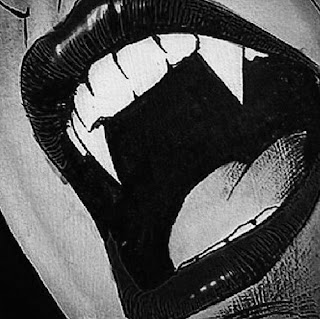
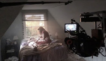
Hi lovelies ! Ive figured out majority of my horror movies title placement. A big struggle I had was incorporating a digital text into the setting. It is not something we could write out or physically have there. I placed it mostly on black objects or desolate places on the screen as planned. Yet movement with the words was a big issue for me. It felt like it kept getting awkward looking. It was also a lot of titles. I felt like if I played with the size even a little it ruined my film. If I made it too big it completely distracted from the setting. If I made it too small it would completely be ignored. I also had to play with the deepness of the red I was using. I absolutely hated the bright obnoxious red look. Yet If I made the red too dark it blended in completely with the setting. This was extremely annoying to work with. I ended up with a nice cherry red that was muted. It was good enough to not be an eyesore, or blend into the setting. A big issue I had was the lighting. We could not manually do the lighting in real life. I assumed I could adjust it in the editing software. I was very wrong about this, I would adjust it a little and it ruined different clips of the same scene. I had to manually go in and change the filters on every clip. I used mainly an eerie blue inspired by twilight. I also used a pale yellow inspired by the Saw movies to add to the horror vibe. Overall the lighting was one of the hardest parts in the editing process. Im happy to say i am mostly finished! Thank you for keeping up with this journey. See you guys soon!

Comments
Post a Comment