Hi lovelies ! Ive figured out majority of my horror movies title placement. A big struggle I had was incorporating a digital text into the setting. It is not something we could write out or physically have there. I placed it mostly on black objects or desolate places on the screen as planned. Yet movement with the words was a big issue for me. It felt like it kept getting awkward looking. It was also a lot of titles. I felt like if I played with the size even a little it ruined my film. If I made it too big it completely distracted from the setting. If I made it too small it would completely be ignored. I also had to play with the deepness of the red I was using. I absolutely hated the bright obnoxious red look. Yet If I made the red too dark it blended in completely with the setting. This was extremely annoying to work with. I ended up with a nice cherry red that was muted. It was good enough to not be an eyesore, or blend into the setting. A big issue I had was the lighting. We ...
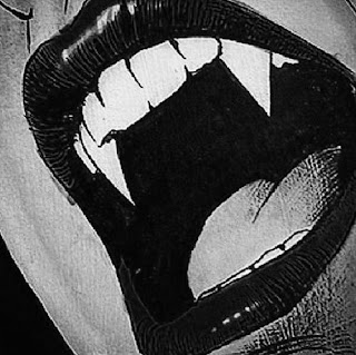
Scene 1- Vidars past is shown through past photographs with her previous victims on her wall. Scene 2- She is getting ready and doing her makeup, and is dressed very elegantly yet modern and feminine. Scene 3- As she heads out the door as she puts a picture of her next victim in her pocket. Scene 4- As she is about to walk into his workplace, she notices from afar and his rather creepy behavior. She observes for a second then goes in to lure him into her plan. Scene 5- She walks into the work place and catches his eye immediately causing him to brush off the previous girl. Scene 6- He approaches her as she is about to order and shows his intentions with her, inviting her to the back of his car after work. To which she replies with "I know a place you'll like more, come meet me here after your done with work" Scene 7- They meet at the park, one thing leads to another and as she's leaning in for a kiss. She bites his neck causing...


Comments
Post a Comment