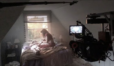
Hi lovelies! Figuring out the availability of everyone we intend to utilize has became an issue. We had planned a day prior, yet family issues came up and we have been struggling to reschedule We tried to do it last Sunday yet someone had to work at 2:30. That would be perfectly fine if we the person giving the rides didn't work at 12:30 that day. The schedule planning is hectic and stressful. We are trying to make sure the ice cream shop is available for us to film in. I also want to make sure we are not filming anyone without permission. Yet the person who works at the ice cream shop works very random days. This is one of the more inconvenient facts but i'm sure we can work around it. One of our actors is going on a trip yet allowed us to film the day before they go since its most ideal for everyone. We are deciding to segment it on this day into different times. We will meet in the ice-cream shop in the morning. Going in the morning will promise us a quiet set in such a publ...
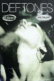
Hey lovelies! Today I am going to be picking the music in preparation for my film. Right off the bat I know I want the music to be apart of the Nu metal/metal or indie genre. I looked through my music to find some songs that may match the vibe i'm going for. Im inclined to use the instrumentals mainly. The first song on my list is "Spiders" by system of a down. I really like the eerie parts between the climax of the drums, it would match the build up of our movie. It also sounds a bit like the "saw" soundtrack which I find very neat. This inclines me to use it more because it reminds me of a horror movie. The next song im considering is "Kimdracula" by Deftones. I like the guitar a lot in the back and I even think the singers voice would fit our film since its more breathy. The song is called "Kimdracula" which also hints that its a vampire themed movie. This song gives the hardcore horror movie elements that we are looking for. I also...
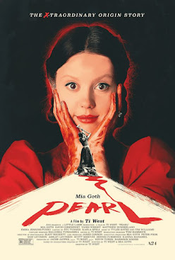
The website artofthetitle.com helped me research this title. - What titles are displayed during the opening sequences? The first title to be shown is the company that presents the film "A24", then it follows up with the production company "A little lamb production" and who the production is in association with " Mad Solar". It also showed who the film is by "Ti West". The movie begins with the main leads name appearing along with other actors and actresses who are starred. It then goes onto mention who casted these actors n actresses, the people in charge of music, costume, the productions designer. Titles stop for a second then come back on to show director of photography, the editor who happens to be "Ti West" from before, the line producer, executive producers (some actors and actresses from the film had this part as well) , producers, and the writers who happens to be the the maker of the film and the other one being the star...
Comments
Post a Comment